Designing, documenting and establishing a design system
Apr 18, 2025
Context
When I joined Nebraska Medicine, I quickly discovered a fragmented digital ecosystem. Different teams had built experiences in isolation, leading to inconsistent visual styles, duplicated efforts, and a lack of cohesion across platforms. Each project was often rushed to delivery without the foundational planning or research that could ensure long-term scalability.
It was clear we needed a more unified approach.
User Need
Our digital teams needed a consistent, centralized system—a single source of truth—to streamline design decisions, reduce redundancy, and ensure alignment with our brand. Developers needed reusable, documented components that simplified implementation. Designers needed clear guidelines and guardrails that would help them move faster while maintaining consistency.
Current Constraint
We had no existing design system, just a scattered patchwork of UI patterns across our web and mobile platforms. This led to inconsistent user experiences and a lot of rework. Additionally, time pressures and lack of governance had made it hard to maintain consistency or even track what components were being reused.
Design Challenge
How might we create a flexible, scalable design system that aligns with Nebraska Medicine’s brand, improves collaboration between teams, and can be tested and implemented across real product environments?
Impact
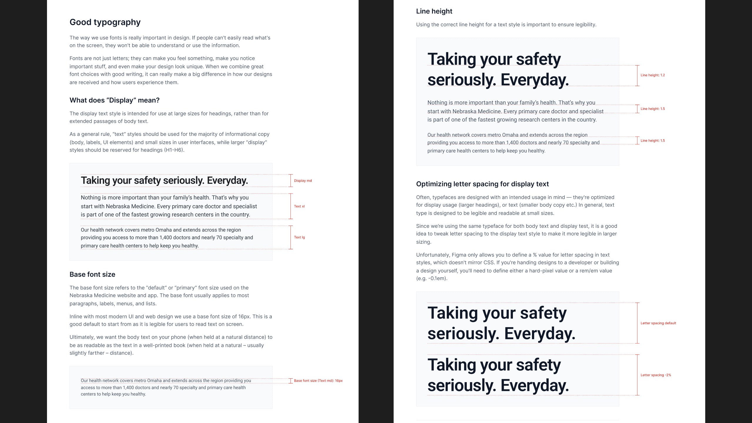
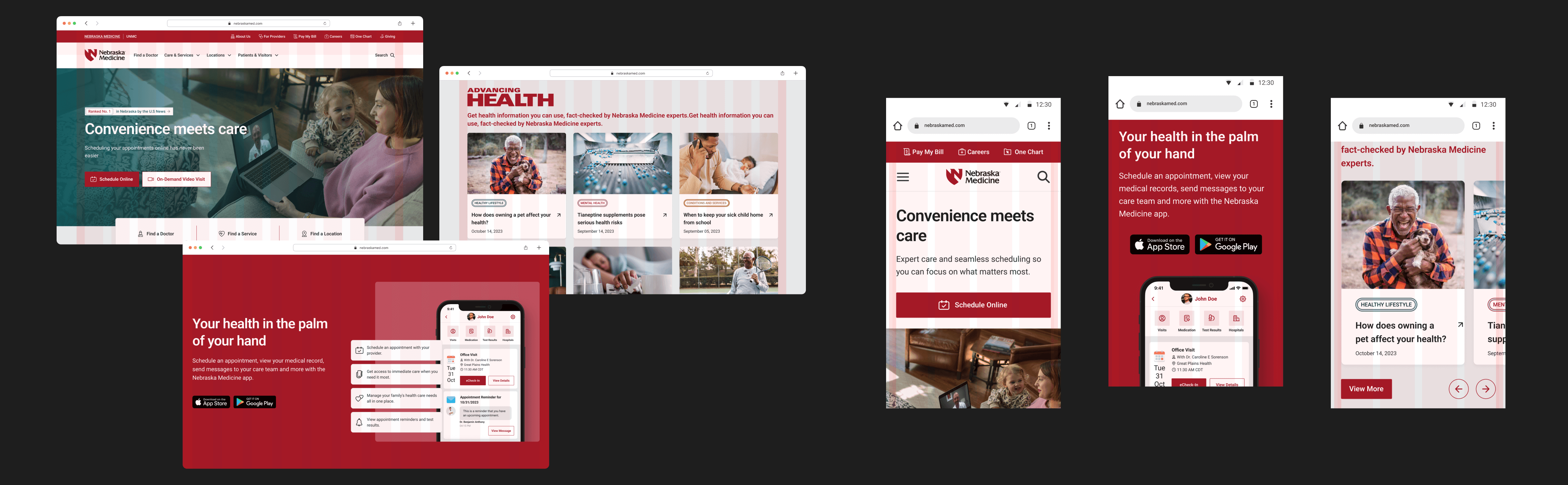
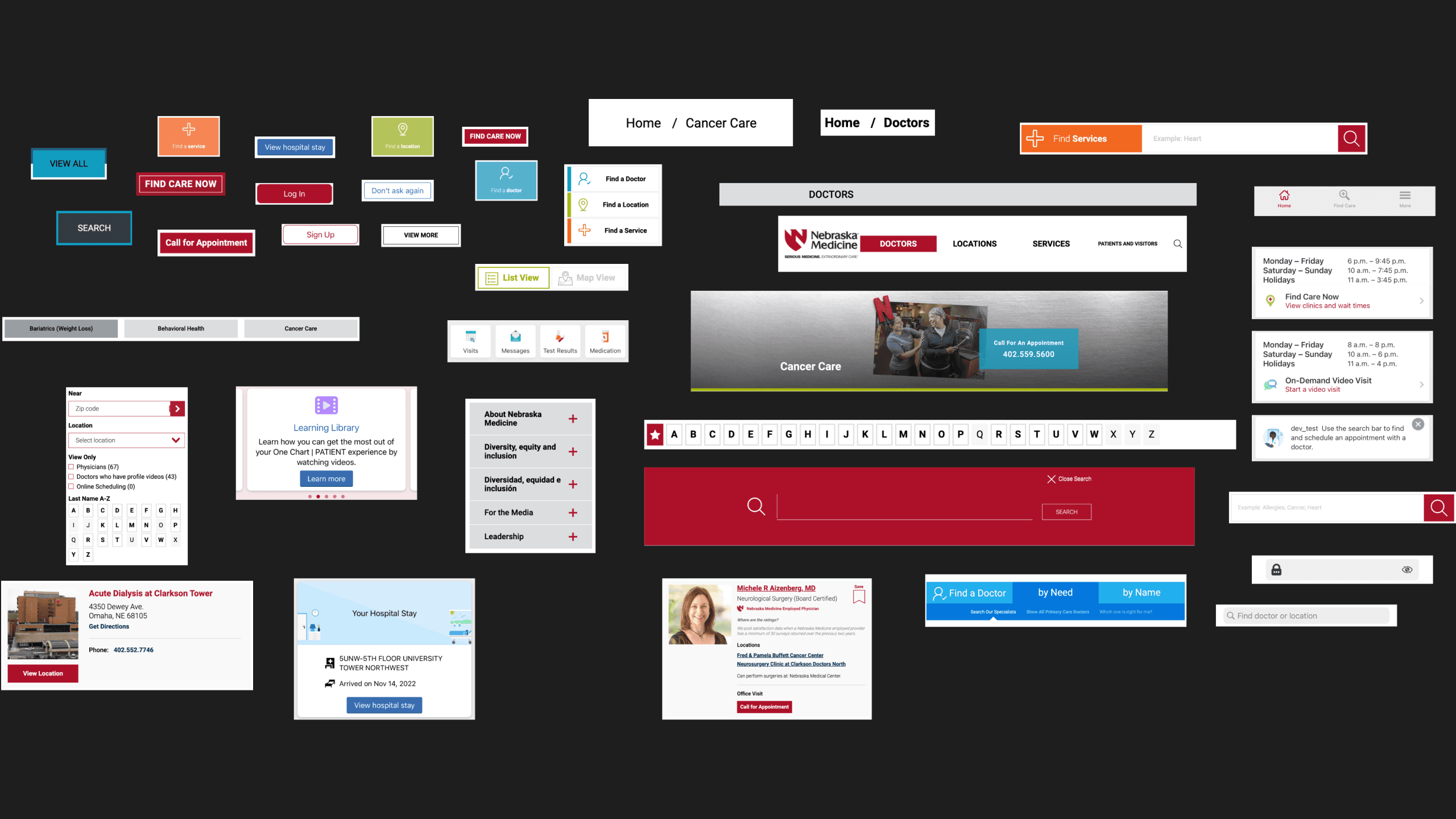
I built a token-based design system in Figma, grounded in principles by Drew Bridewell, which included core elements like spacing, type scale, colors, and reusable components with interactive states. Everything was designed for adaptability—whether for mobile or desktop—and structured using Auto Layout and Figma Variables. I also created multiple breakpoint-ready designs and prototyped real-world scenarios to test the system live.
To ensure adoption, I worked with a copywriter to develop robust documentation—including WCAG 2.1 color contrast compliance—and made it easily navigable like a website within Figma. We stress-tested the system starting with internal login pages and are continuing to refine it as we prepare for broader rollouts.
The result? A system that’s easy for designers to use, speeds up dev handoffs, and improves the cohesion and quality of every user experience we ship. And as Nebraska Medicine continues to grow, this system grows with us.